Brand image
Graphics standards
Alphabet design
Signage
Print design
NATIONAL BANK OF CANADA

When the financial companies Banque Provinciale and Banque Canadienne Nationale merged, we were approached to create a new entity called the National Bank of Canada. After three weeks of sketches by the entire team, Vasco suddenly has a strike of genius in the middle of the night and creates the stylized 3D “N” logo that evokes a flag fluttering in the wind. Before proposing the concept to the board of directors, the logo was evaluated using focus groups in blue version (more conservative) and red version (more avant-garde for a bank). Surprisingly, English speakers leaned more towards the blue version while French speakers reacted better to the red color.

BRAND IMAGE

INTERACTIVE GRAPHIC STANDARDS
BANKING MACHINE LOGO
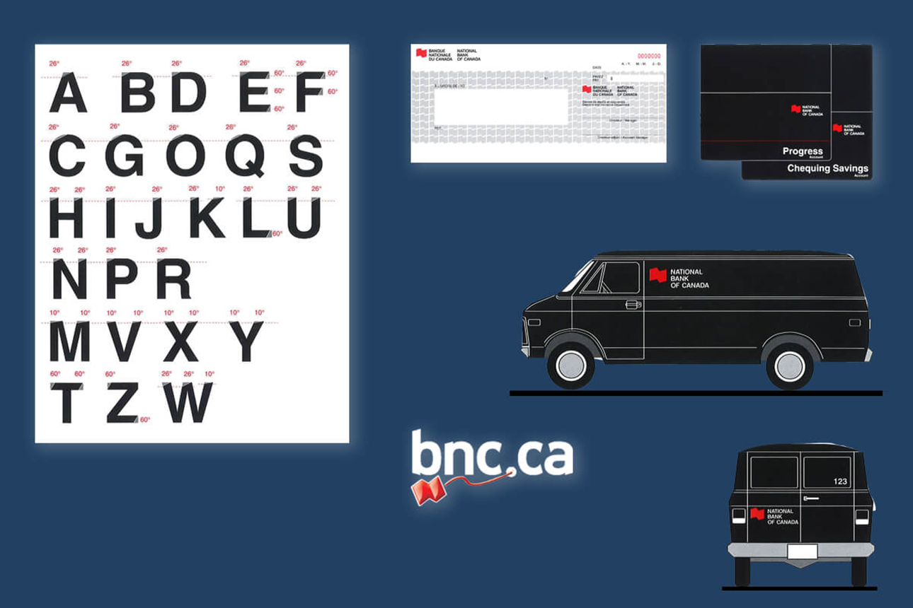
ALPHABET AND VARIOUS APPLICATIONS


SIGNAGE OF BRANCHES AND BANKING MACHINE