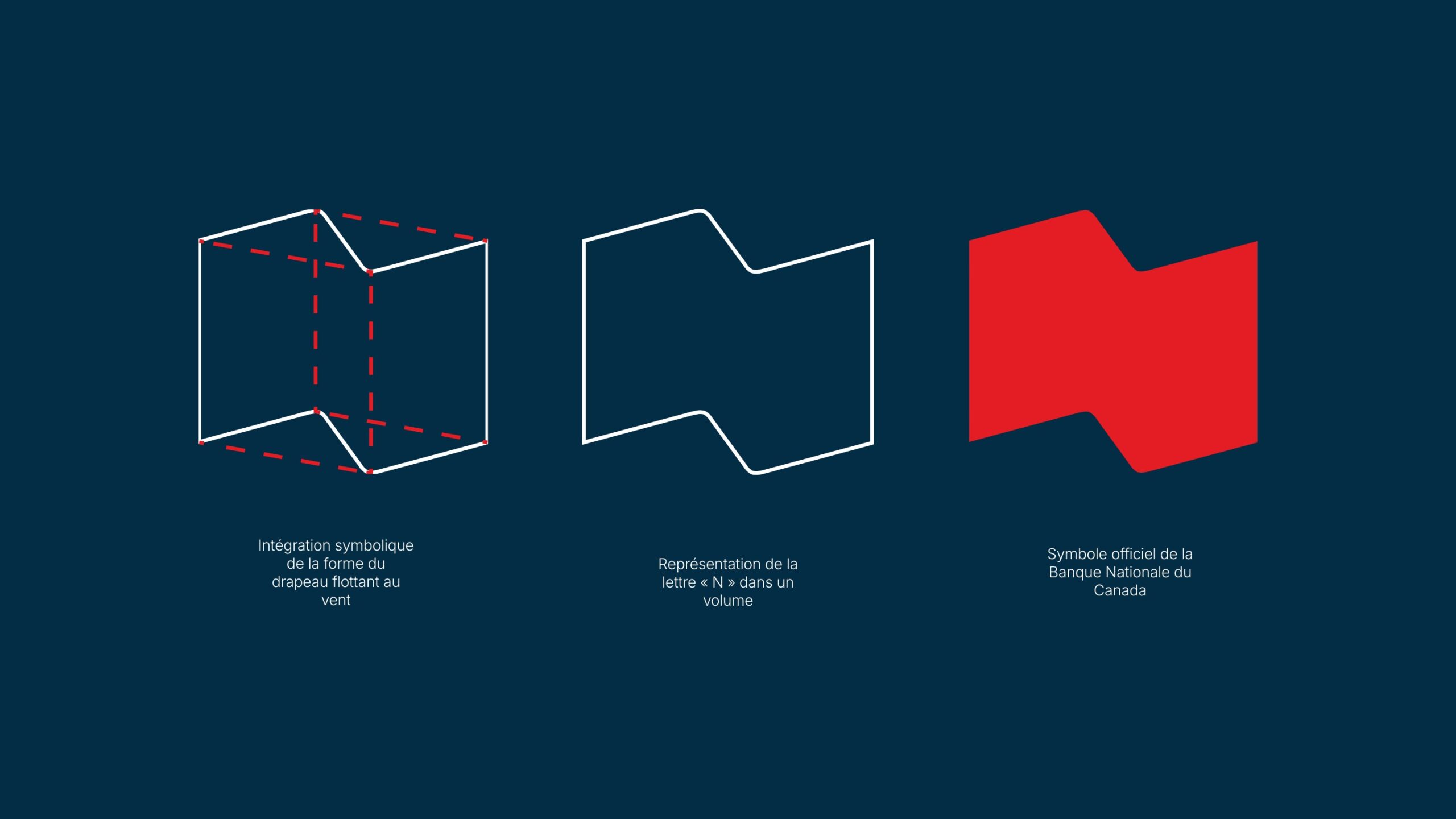
Visual identity developed for the National Bank of Canada following the merger of Banque Provinciale and Banque Canadienne Nationale. Inspired by movement and stability, the stylized “N” logo evokes a waving flag—a symbol of an evolving institution.
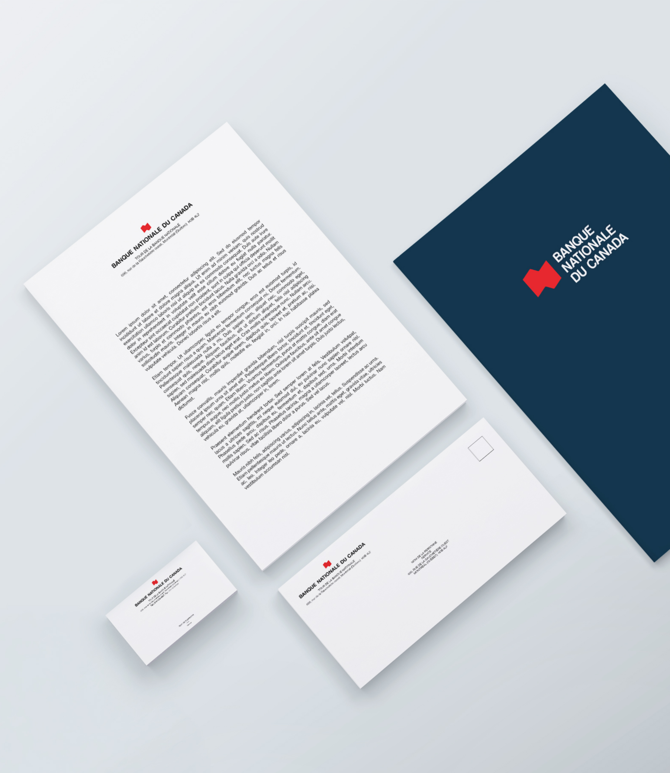
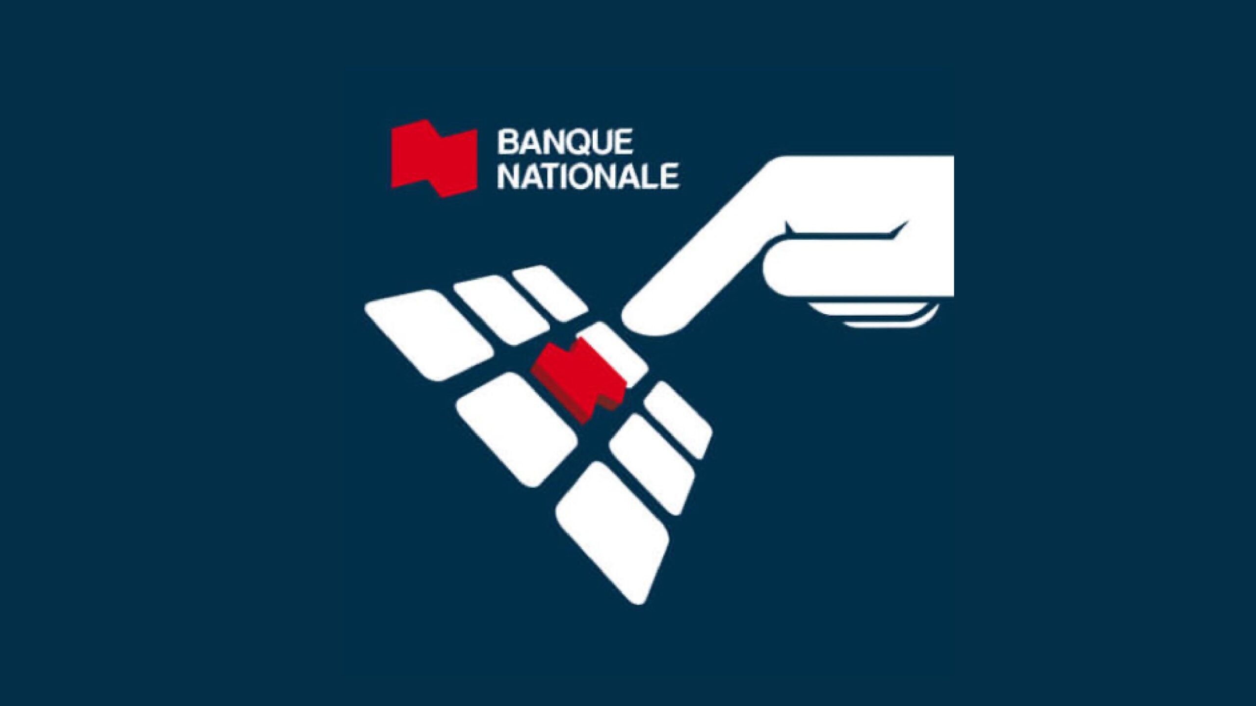
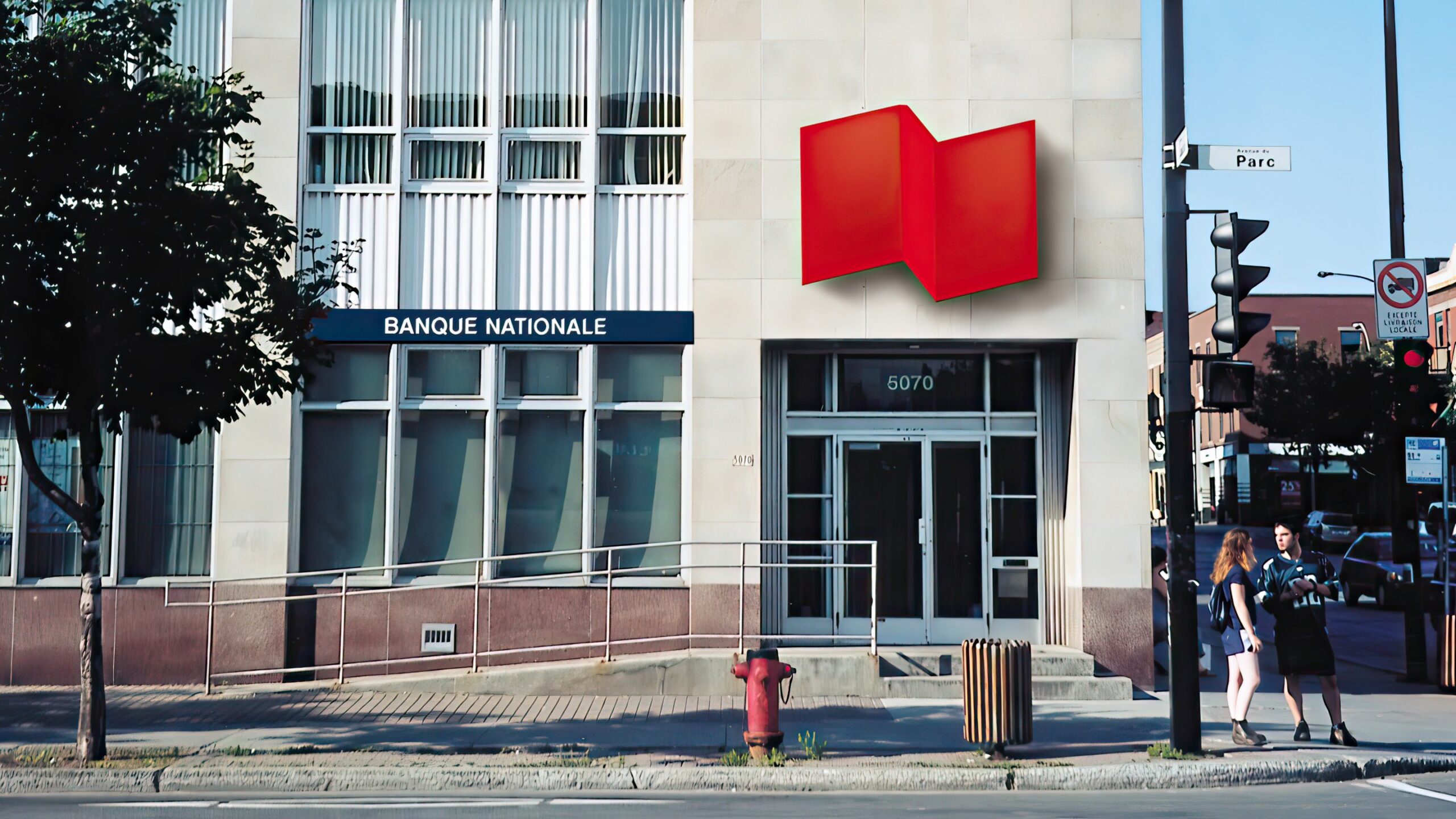
Beyond the logo, the mandate included a wide range of visual applications: print and promotional materials, digital assets, branch signage, and fleet branding. Still in use today, this identity embodies the strength and forward momentum of the National Bank of Canada.


